
Guides
Best Black Friday Icons for 2026
Scott Lewis
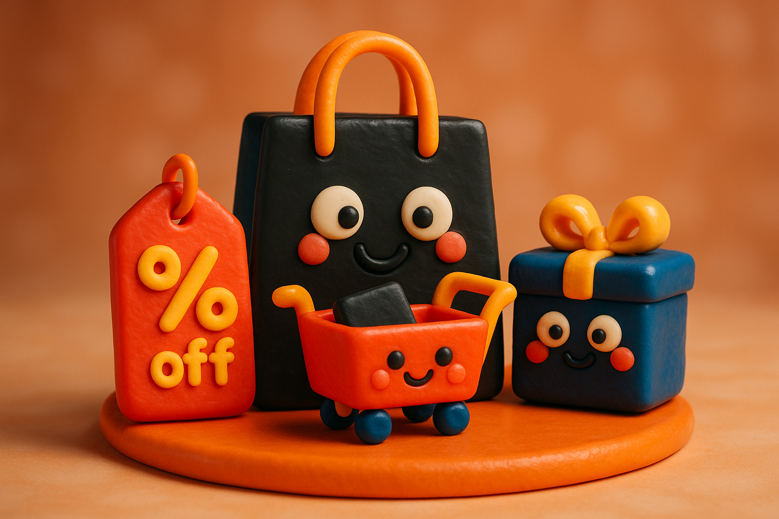
If you design for retail, Black Friday season means the same scramble every year: banners, push notifications, countdown emails, and app screens that all need to say 'buy now' without looking like a clip-art clearance bin. This collection pulls together twelve sets built specifically around that language, carts, price tags, percentage badges, delivery trucks, checkout counters, so you're not hunting across a dozen marketplaces for icons that actually match. It's aimed at working designers putting together real campaigns, not just browsing for inspiration.
The Core Cart-and-Bag Library, 300 Deep
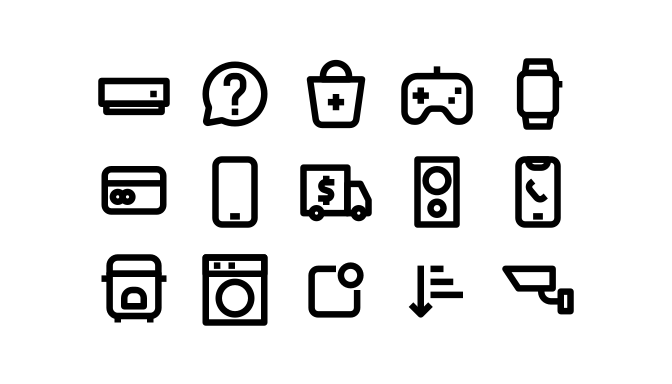
This is the workhorse set: Add To Bag, Add To Cart, and Cart appear in multiple numbered variants, which usually means you've got idle, hover, and active states ready to drop into a real checkout flow. At 300 icons it's large enough to anchor an entire site's commerce iconography on its own, rather than patching gaps from three different sources.
300 icons.
Point-of-Sale Details: Scanners, Cards, and Sale Tags
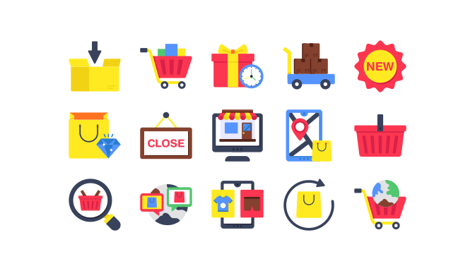
Where a lot of ecommerce sets stop at carts and bags, this one of 130 goes further into the mechanics of a sale: a barcode scanner, an ATM card, a 24hr service badge, and an Add Sale Tag icon all show up by name. It's a good pick if your campaign needs to show the actual transaction, not just the shopping part.
130 icons.
A Parallel Take on the Same Retail Fixtures
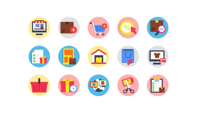
This 130-icon set covers almost the same ground as its companion, the 24hr badge, the ATM card, the sale tag, the barcode, but drawn as its own self-contained collection. Having both gives you a second visual option if the first set's weight or proportions don't quite fit your layout.
130 icons.
UI Chrome for Checkout and Wishlist Screens
This 100-icon set mixes interface basics, a bookmark ribbon, a back arrow, an alarm clock, with retail-specific pieces like an ATM withdrawal icon and an Add Sale Tag mark. It's built for the screens around the sale itself: wishlists, timers, navigation, and payment confirmations.
100 icons.
A Second Interface Set, Now With Compass and Clock
Nearly the same cast as its companion set, bookmark, ATM withdrawal, sale tag, back arrow, but this 100-icon version adds a compass alongside its alarm clock. Useful if your app needs a location or navigation icon to sit next to your countdown timer without switching styles.
100 icons.
A Third Pass on the Same Interface Elements
Same core list again, bookmark, back arrow, ATM withdrawal, sale tag, clock, compass, at 100 icons. Three near-identical sets like this exist so you can pick the exact line weight that matches your product's other UI icons instead of forcing a mismatch.
100 icons.
Fulfillment and Shipping, From Cargo Ship to Doorstep
This 100-icon set steps past the storefront into logistics: Container, Delivery Route, Delivery Site, and Cargo Ship cover the supply chain, while Balloon Delivery and Feedback bring in the lighter, post-purchase moments. Good for order-tracking screens, shipping confirmation emails, and any Black Friday page that needs to reassure shoppers their order will actually arrive on time.
100 icons.
A Black Friday Signboard, Bonus Coins, and a Buy Button
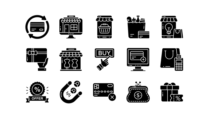
This 100-icon set includes an icon literally named Black Friday Board, plus Hr Shop Open and Hr Sale marks for always-on promotions. Attract Customers and Bonus Stars round it out with a loyalty angle, and a dedicated Buy Button icon with a hand gesture gives you a strong, literal call-to-action for banners and app screens.
100 icons.
Big Sale Badges and the Checkout Counter
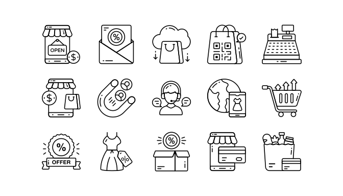
The standout here is a cluster of Big Sale, Big Deal, Big Offer, and Big Discount icons, exactly the bold, shouty badges a Black Friday banner needs. This 100-icon set pairs them with Add Card Payment and Cash Register icons, so the badge that gets attention and the icon that closes the sale come from the same visual family.
100 icons.
Two-Color Line Icons With a Dedicated Black Friday Mark
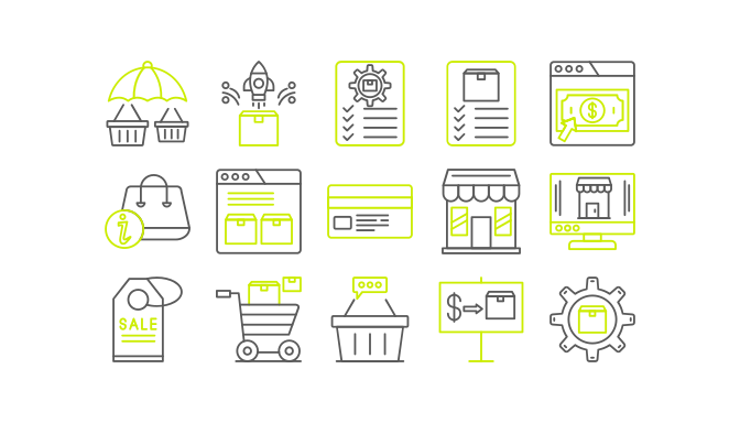
At 99 icons, this set uses a two-color line style and includes an icon simply titled '89 Black Friday,' which tells you it was drawn as part of a larger numbered system rather than tacked on as an afterthought. Advertisement, Marketing, and Product Management icons sit alongside it, making this a solid pick if your campaign assets need to feel like one coherent brand system rather than a pile of mismatched clip art.
99 icons.
Flat Circle Badges Built for Thumbnails and Ad Tiles
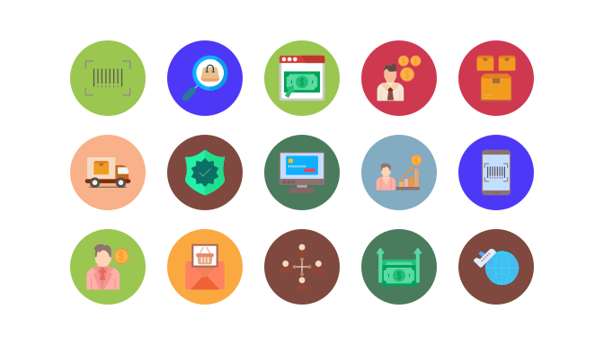
These 99 icons are enclosed in flat circles, a format that holds up well as a small social ad thumbnail or app icon where detail gets lost. It also carries its own '89 Black Friday' icon alongside Add To Basket, Auction, and 24 Hour marks, so the seasonal piece matches the rest of the set instead of looking borrowed.
99 icons.
Line-Filled Circles Covering Checkout to Back-Office
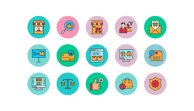
This 98-icon set has the same circular format as its flat-circle sibling but rendered as filled line art, and it covers more ground than most: Basket, Buy, Cart, and Checkout handle the storefront, while Administrator, Finance, Hosting, Merchant, and Reseller icons speak to the seller-facing side of a marketplace. That range makes it useful beyond customer-facing pages, into admin dashboards and vendor portals too.
98 icons.
Frequently asked questions
Do these icons work for both web and app campaigns?
Yes. Most sets include the SVG and vector formats you'd expect, so the same cart or sale-tag icon can go into a web banner, a mobile app screen, or a push notification without redrawing anything.
Will this still look current for Black Friday 2026, or is it tied to a specific year's trend?
The styles here lean flat, line, and two-color rather than anything trend-locked to a single season, so they hold up past one shopping event. A couple of sets even include an icon literally labeled for Black Friday, but the bulk of the library is evergreen retail iconography.
Why are there multiple sets with nearly identical icon names?
A few of these sets are companion collections from the same contributor, covering the same retail fixtures (sale tags, 24hr badges, ATM cards) in slightly different line weights or circle treatments. That's intentional. It means you can match an icon style to your specific layout instead of settling for whatever one set happens to include.
Who makes these icons, and how are they licensed?
Every set comes from a vetted contributor on VectorIcons, and contributors keep 70% of direct sales, so buying here puts money back into the people actually drawing these shapes. Check each set's listing for its specific license terms before using it in a commercial campaign.